I have compared all my all-in equities and results in last 2 months.

Hello.
I've compared all my all-in equities and results in last 2 months(to be precise, Jul~Aug 2025) using my analysis tool coded by myself.
In this period, I've did 970 all-in showdowns, 795 of them were started at preflop, and 599 of preflop all-in showdowns were heads-up.
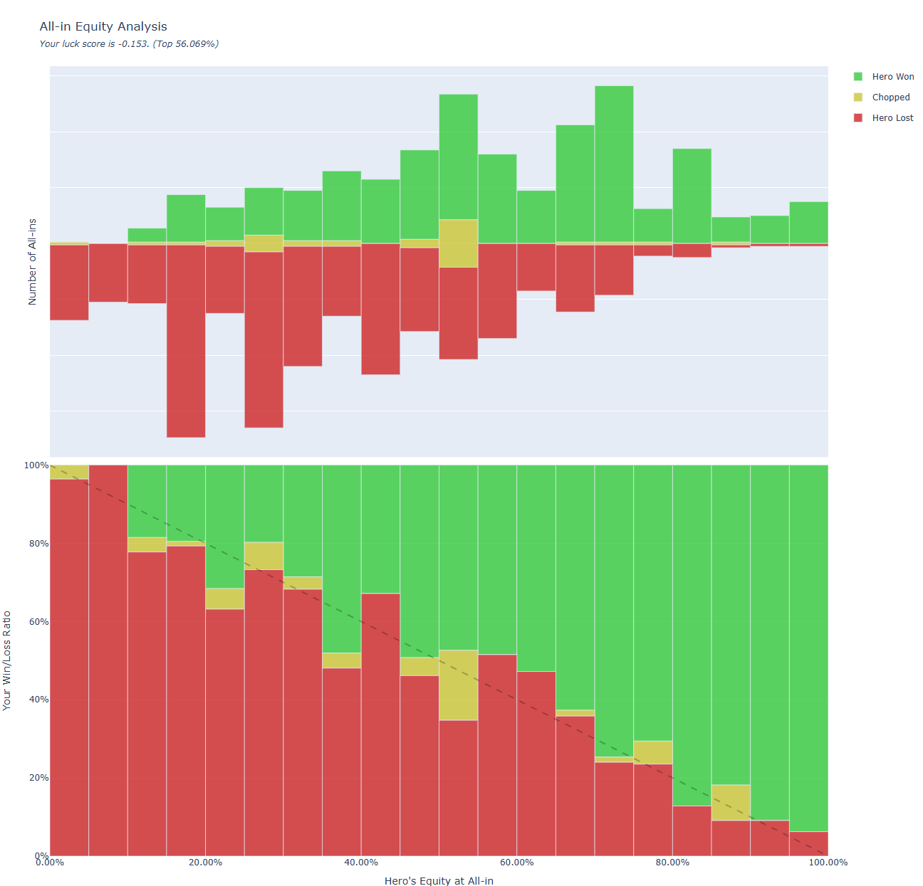
- X axis of both charts is hero's equity when all cards are opened. (0% left, 100% right)
- Y axis of upper chart is absolute number of showdowns I performed.
- Y axis of lower chart is win/loss ratio.
- Green blocks mean hero wins.
- Yellow blocks mean tie(chopped).
- Red blocks mean hero lost.
If you analyze many hands, then it is surprisingly converging to the expected equity. I suppose the result chart from data of almost all people goes like this. The chart picture above is generated from even less than 1k all-in showdowns, and it still shows my actual results are converging to expected equities.
But then why would people(especially tournament players) think they are unlucky? Because each pots have different impact that makes an illusion on player's mind.
Thanks for reading this.
2 Replies
I have added new charts; Tournament chip histories. The entire data is from Jul~Aug 2025.
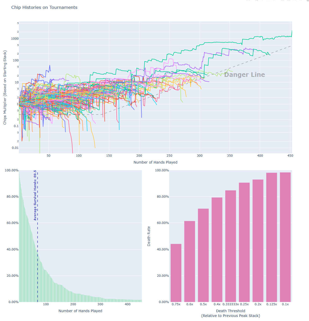
You can see the exact chart HTML made by my data here.
The upper graph is the chip histories. X axis is a number of hands played, and Y axis is a relative log-scale of chips compared to the starting stack. Danger line is created by just some handmade formula to represent "If you go below here, you are most likely dead."
The left lower graph represents how many hands you played. I have survived until Hand 100 in 24.2% of tourneys, and until Hand 300 in 3.5% of tourneys.
The right lower graph represents "Death Threshold" - For example, the "0.25x bar" has 90% value, which means if you fall below "0.25x of previous peak stack", you will never go up again and die in 90% of cases. This graph shows being short stack is deadly in tournaments.
In the analysis tool version 2.2, I've added hand usage statistics by position.
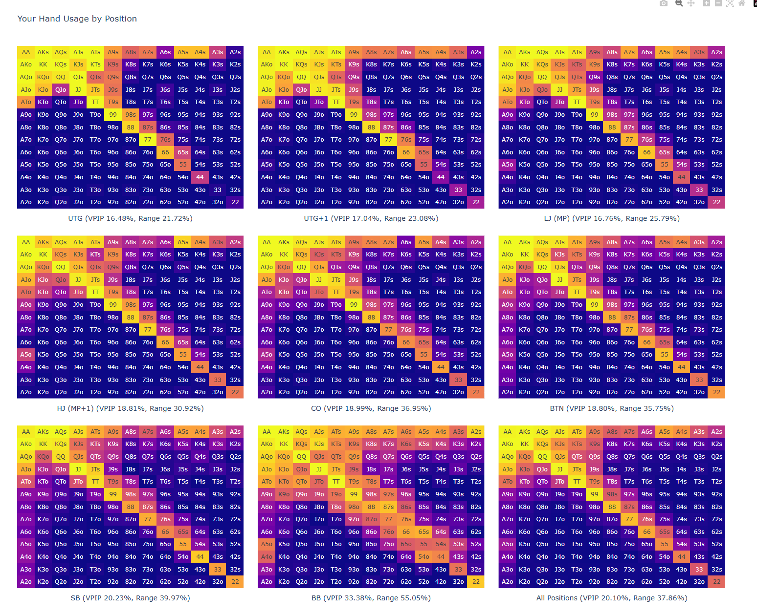
Here VPIP counts when you did not fold at first(calling to early opens, open raises, 3bets, etc). VPIP still counts even if you fold against 3bet/4bet from later positions. Range means "How many of hands have 10%+ VPIP as individual hand".
Opening range does not necessarily correlate to actual VPIP because we fold some hands of opening ranges when some people in earlier positions opens/3bets. The best example to explain this would be AA vs AJo in UTG vs SB. In UTG, I almost always open AA & AJo because I am the first actor. In later positions, I fold AJo against early open or 3bets, therefore VPIP of AJo at SB decreases - however I still does not fold AA on almost every situation so VPIP of AA remains high(yellow color).
I think my range is relatively static(not using K3s etc enough in CO~BTN etc) and that is probably my imbalance made while playing in micro stakes for a long time.

